Surface mining in western Georgia
Using satellite data to quantify environmental damage
This project was to fulfil the requirements for the GIS micro-credential course at Southern Institute of Technology in 2025.
Project area
The online publication Mountain Stories released ‘Chiatura: Zone of a Disaster’, a documentary about surface mining in the Imereti region of the republic of Georgia. Georgian Manganese has been open-pit mining around the city of Chiatura since 2006. The mining has resulted in surface erosion, air pollution from dust, and heavy metal pollution of the Qvirila River, which runs through Chiatura. Georgian Manganese is legally required to remediate surface mining sites, but in 2017 government officials waived a fine of 416 million lari (around 233 million New Zealand dollars) and appointed a ‘special investigator’, bringing any investigations out of public view.
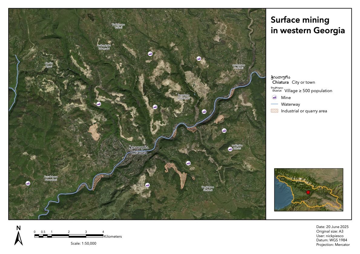
Frustratingly for me, the documentary was missing maps of the area so I could orient myself geographically and be able to gauge the extent of the damage. Looking at satellite maps, the surface mined area was readily obvious. I thought it would be interesting to see if I could track the mined area over time to see if I could tease out any trends.
Data collection
The Georgian government does not appear to provide publicly-available GIS data. Using Google Translate, I investigated the websites of the Ministry of Environmental Protection and Agriculture and the Ministry of Regional Development and Infrastructure and couldn’t find any relevant data.
Open Maps for Europe and OpenStreetMap provided line and polygon data for natural and political features and land use. I thought it would be interesting to start with data for mines (point data provided) and quarries and industrial areas (polygon data provided).
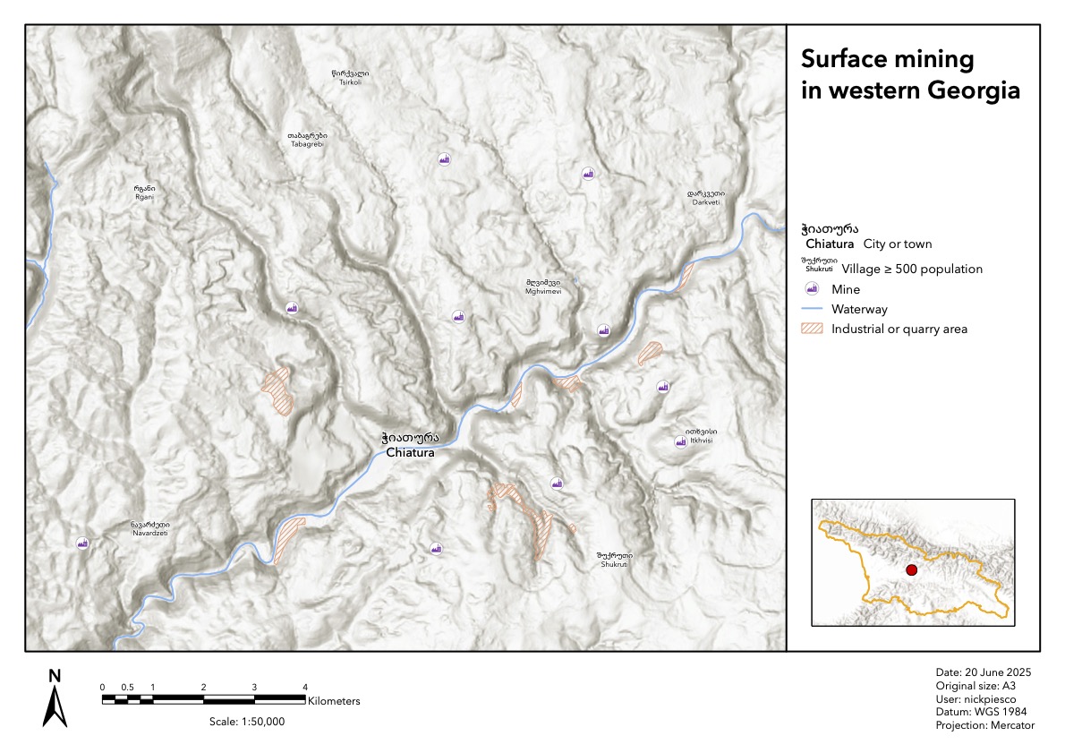
I corroborated the data for the survey area with information from the United States Geological Survey Mineral Resource Data System, but the data only slightly correlates with the satellite-viewable mining areas.
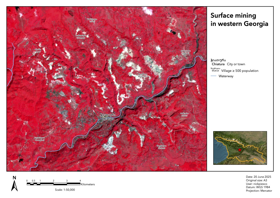
Using the Copernicus Browser, I looked through Sentinel 2 mosaic data to see if any of their products provided a good contrast between the mined area and the undisturbed area. The false colour imagery provided a delineation clear enough that I could use automated tools in ArcGIS Pro to find the mined areas and calculate the area.
Geospatial processing
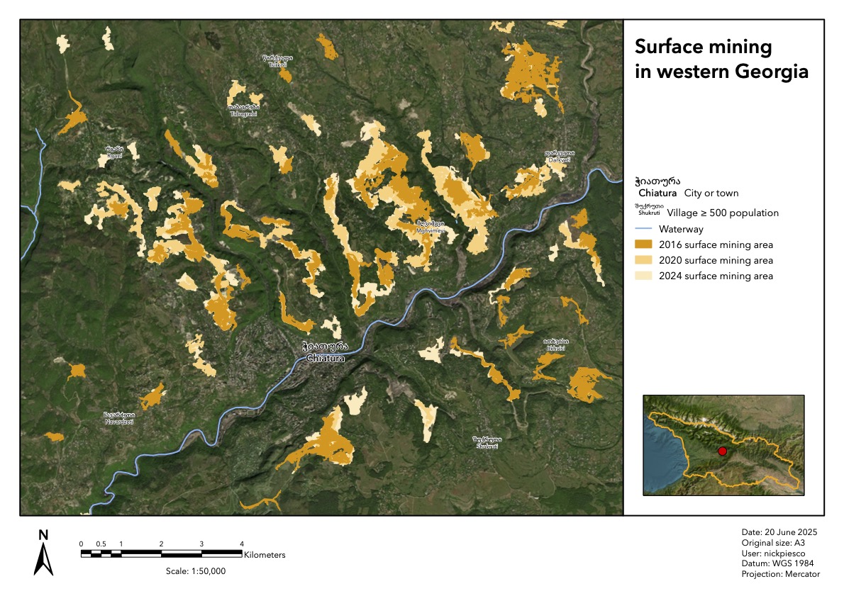
The data available from the Copernicus Browser starts in 2015. I chose to capture images from the local summertime (August) to try to get the best contrast between land use types. This left me with imagery from between 2016 and 2024. I processed images from 2016, 2020, and 2024 for the best balance of ability to see changes and processing time.
I used the Image Classification tool to break down the false-colour data. Because the areas were fairly well-delineated in the image, I had ArcGIS Pro use the unsupervised and nearest pixel options, and I chose the default classes. This did a good job of picking out the data; but since I used the automated classification tool, each run of the classifier put the mined area in a different category. I was able to visually distinguish the category I wanted and isolated it with a definition query; but if I were to do this again in the future, I might either give the classifier manual hints or export the layers so I don’t have to rely on queries for further manipulation.
This provided raster imagery for the three views in the time series. I then used the Raster to Polygon tool to create vector data. Visually inspecting the polygon data against the raster data showed generally good results, but the classified data did show a lot of ‘noise’. I filtered out the smallest polygons by Shape_Area, leaving polygons fairly congruent with the satellite data behind.
I wanted to measure the area of the polygons, but I didn’t know what units were being used. I went into the attribute table, created the field area_km2, and used the Calculate Geometry Attributes tool to populate that new field with the area of the polygons in square kilometres. Using the Summarise tool, I found the total area of all the polygons in the layer.
Conclusions
The data shows surface mining area continues to increase across the survey area. Rounded to the nearest 1000 square metres:
- 2016: 5.324 km²
- 2020: 6.061 km²
- 2024: 6.780 km²
Sources
Copernicus. Copernicus Browser. https://browser.dataspace.copernicus.eu/
DIVA-GIS. DIVA-GIS Data. https://diva-gis.org/data.html
EuroGeographics. Open Maps for Europe: Access Data. https://www.mapsforeurope.org/access-data
Geofabrik GmbH and OpenStreetMap contributors. Geofabrik Download Server: Georgia. https://download.geofabrik.de/europe/georgia.html
Mtivlishvili, Gela 2013. Chiatura: Zone of a Disaster. https://mtisambebi.ge/en/news/item/1341-chiatura-–-zone-of-a-disaster-journalist-investigation
United States Geological Survey. Mineral Resources Data System. https://mrdata.usgs.gov/mrds/show-mrds.php?dep_id=10255409