This One Simple 600-Year-Old Trick Makes Your Website More Accessible!
What do colours, metals, and furs have to do with the Web, anyway?
This is from a talk I gave at CSS Meetup Wellington in September 2018.
‘Accessibility and the Web’ sounds like a thoroughly modern set of challenges, but it includes problems that people have been trying to solve for hundreds of years. In mediaeval times, a knight being able to recognise a friend or foe at a distance was a matter of life and death. Rules evolved around the coats of arms that they bore to make identifying each other easier, giving birth to the science of heraldry. Those rules can still be useful to us today – including the most important one of those rules, the one around colour contrast.
- Why colour contrast?
- How we see, or don’t
- The science of heraldry
- Writing it down
- Heraldry goes modern
- Speaking the same language
- The Rule of Tincture
- Breaking the rules
- Related links
Why colour contrast?
Because accessibility is important, and colour contrast is a vitally important part of that! The Web Content Accessibility Guidelines are organised around four principles:
- Perceivable: the user has to be able to see the interface
- Operable: the user has to be able to work all the inputs and controls
- Understandable: the user has to be able to comprehend what’s on the screen
- Robust: the content should be able to be displayed on a wide variety of user agents, including assistive technologies
We’re going to focus on a small slice of the first one, ‘perceivable’.
Making sure your colours are accessible can help more people that you might think. Worldwide, about four percent of the world’s population has low vision, and about six tenths of a percent are blind. Seven to 12 percent of men have some sort of colour vision deficiency, but less than one percent of women do. And vision tends to deteriorate as you get older – about half of people over 50 have some sort of low vision condition, and over-60s are the fastest-growing population worldwide. So let’s spitball that about ten percent of our users could benefit from help making things on our application easier to see. (This data is shamelessly cribbed from this excellent Smashing Magazine article.)
How we see, or don’t
When we talk about colour contrast, we really mean luminance, or brightness, contrast. That’s for a couple reasons: first of all, there are a bunch of different kinds of colour vision deficiencies, so working around one of them doesn’t necessarily mean that people with another one of those conditions will benefit. Second, it’s easier to see the difference between light and dark than it to see the difference between colours anyway.
It has to do with biology. Here’s a diagram of the human eye:
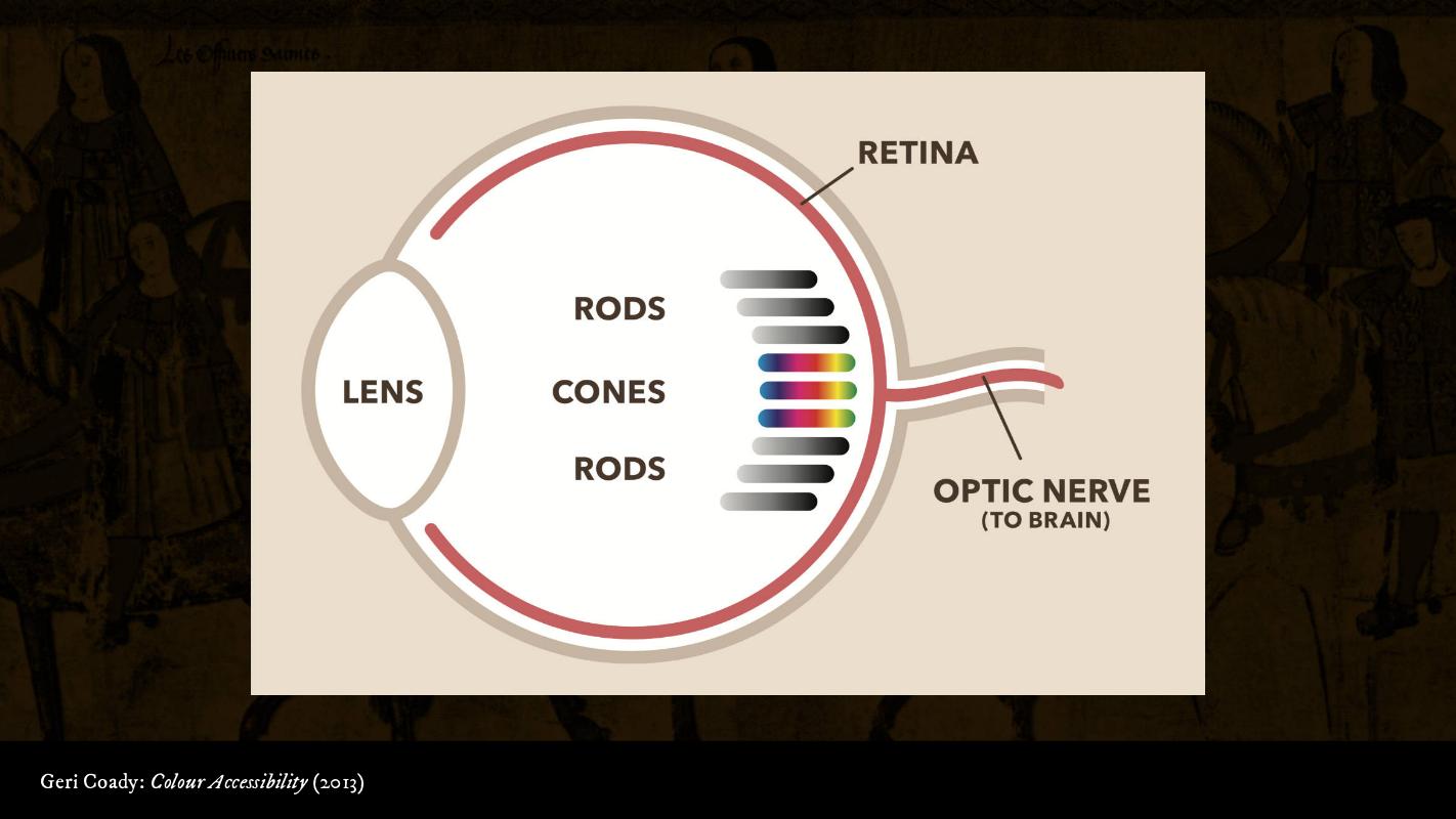
Light comes in through the lens and hits the retina at the back of the eye. The retina has two types of cells: rods, which are responsible for our ability to see light and dark; and cones, which are responsible for colour vision. Rods are really sensitive – they can be triggered by a single photon. Cones, on the other hand, need a lot of light to work. Think about when you’re stumbling to the bathroom in the middle of the night – you can see outlines and shadows, but you can’t really see any colour until you turn the light on.
Not only are rods more sensitive, but there are a lot more of them: about 120 million in a typical eye versus only about six million cones. So when we’re working with colour contrast, we’re really talking about the difference betwen light and dark.
So to comply with these guidelines, we have to hit a certain contrast ratio. How do we compute it? Easy peasy!
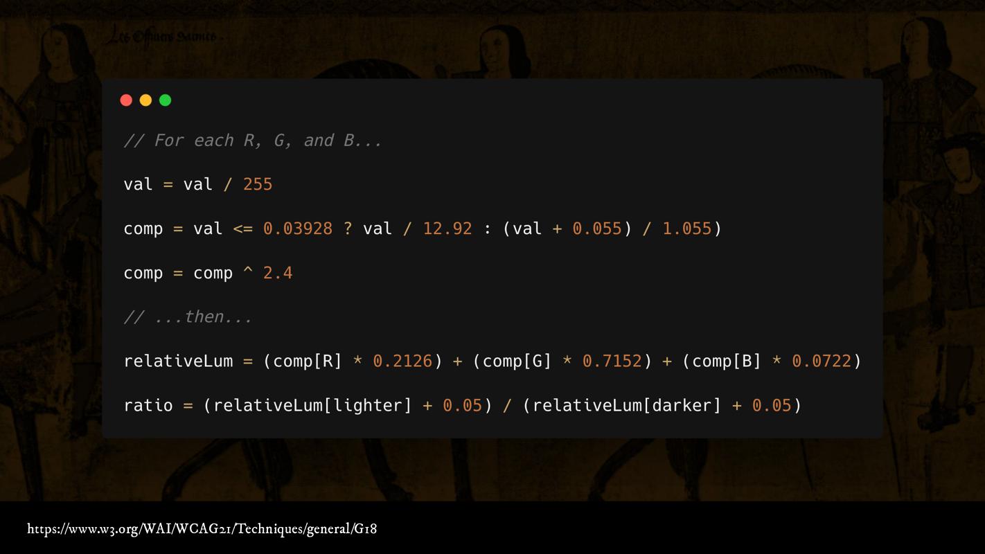
If this is your idea of fun, feel free to do it yourself; or you can use an online colour-testing tool. I like the Colorable text demo; because not only is it easy to use, but it also uses HSL, which is a little different to the other libraries that just use RGB.
Colour is one of those things that sounds really complicated, and then you start reading about it and learning more, and then it... gets even more complicated. If you’re interested in learning more, I recommend ‘Colour: From Hex Codes to Eyeballs’, an excellent deep dive into how colour goes from the screen to your brain.
The science of heraldry
Let’s turn now from the science of vision to the science of heraldry. I’m going to focus on the English heraldic tradition for two reasons: first, because that’s the one I know the most about; and second, as a resident of a Commonwealth nation that doesn’t have its own heraldic authority, It’s the set of rules that I am personally subject to here in New Zealand.
More specifically, let’s talk about the science of armory.
‘Armory is that science of which the rules and the laws govern the use, display, meaning, and knowledge of the pictured signs and emblems appertaining to shield, helmet, or banner.’ A.C. Fox-Davies
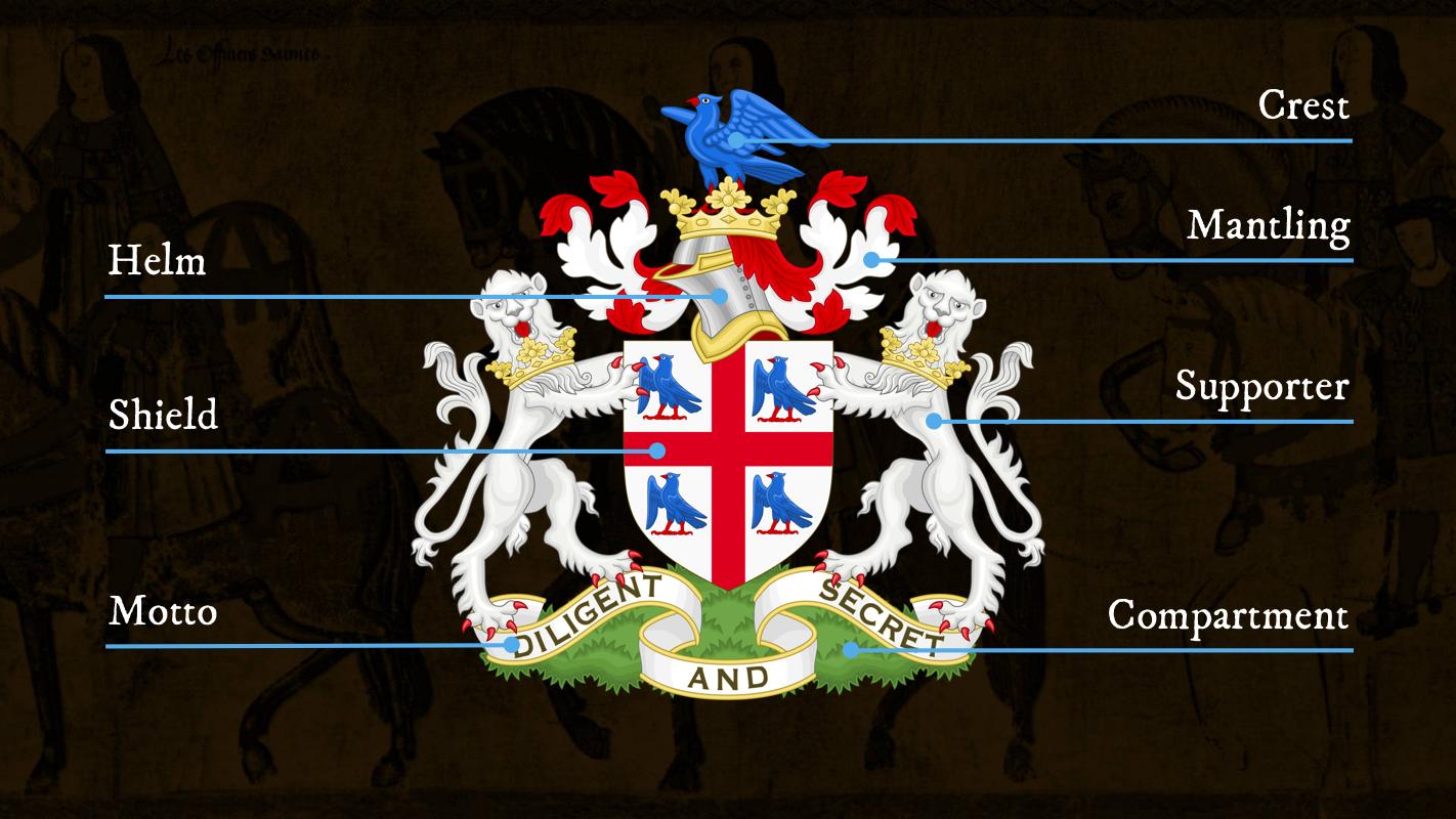
This is what’s called an ‘achievement’, a full illustration of a coat of arms. You may have heard it called a ‘crest’, but that’s not technically correct – the crest is just the bit that sits on top of the helmet. There’s mantling – the fabric that keeps the sun off the back of the knight’s head, which is cut up from battle and flowing in the wind. The helmet sits on top of the shield. Sometimes, the shield has supporters, who stand on a compartment; and a scroll with the motto sits below. We’re going to focus on the shield, the main part of the arms.
Arms have two main qualities:
- They’re personally identifiable – no two people have the same arms.
- They’re easy to identify at a distance, thanks to their history of being used in battle.
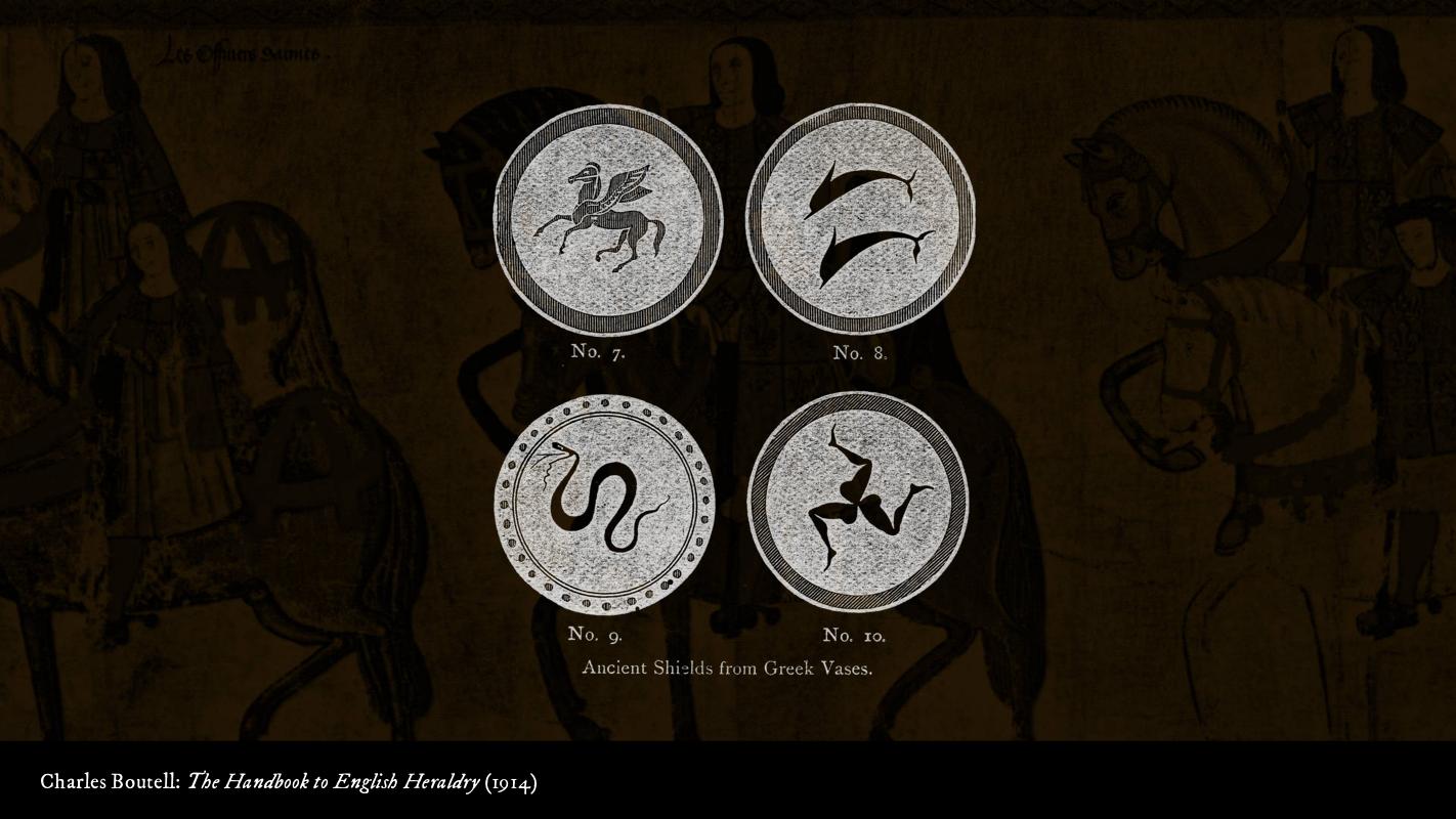
People have been decorating things since time immemorial. Ancient Greek soldiers decorated the shields they carried into battle, but there’s no evidence that the symbols were tied to an individual person. It’s like a shirt or a pair of earrings – it’s not something that says ‘this is who I am’; it’s just something you think looks cool that you decided to wear that day. Artists and heralds did eventually borrow some of these symbols to use in modern heraldry, though – the three-legged device is the symbol of Sicily and the Isle of Man.
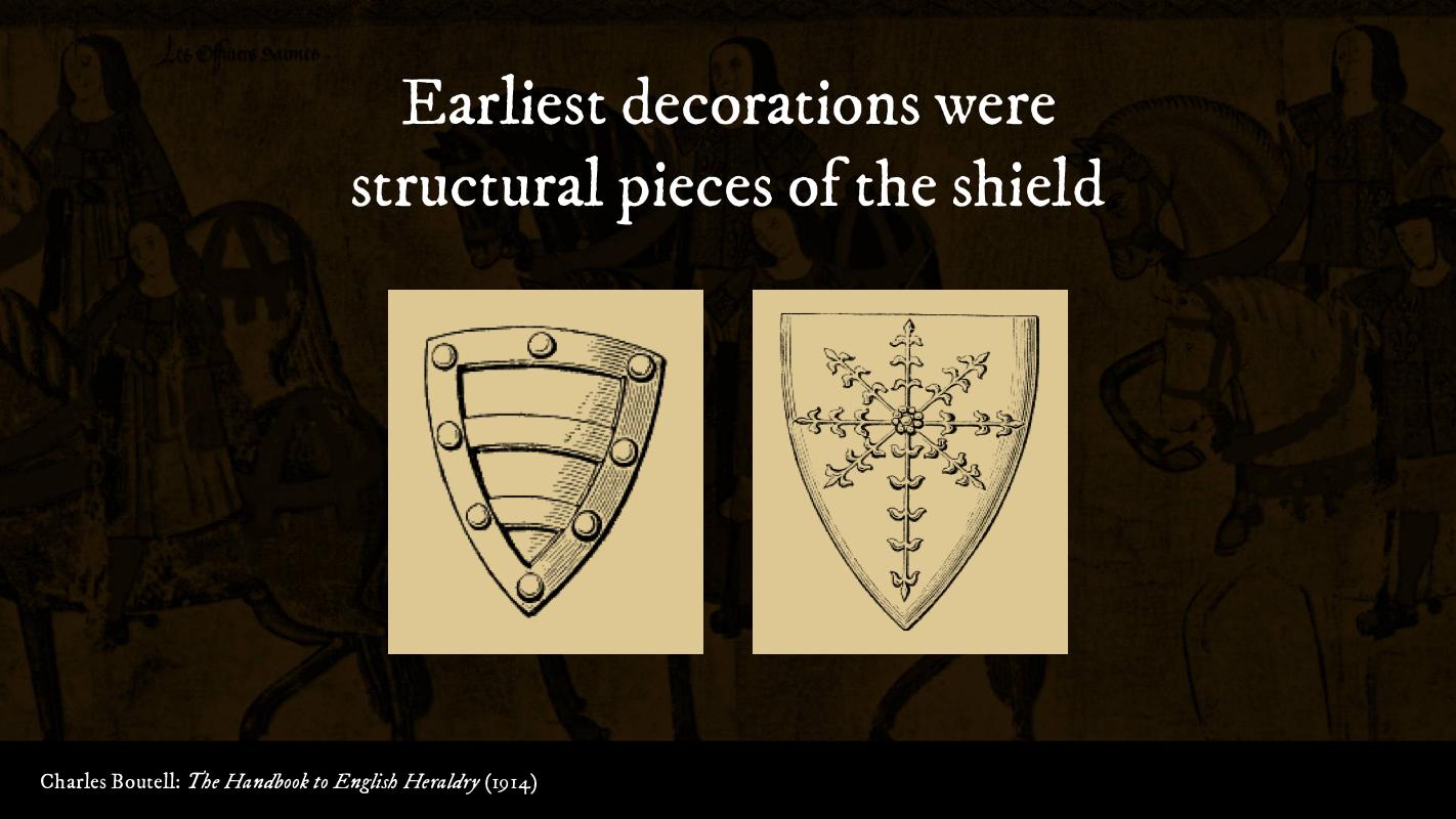
Early charges, or things on a shield, were based on structural bits of the shield: you see the reinforcing strapping and the connections to the rim. The middle bit where the handle was attached was extended into cross and floral motifs: this particular one is called an ‘escarbuncle’. But we’re still missing the main piece – the arms being a personally identifiable symbol.
We see that in the early 1200s, thanks to the invention of the closed-face helmet. Think about it – if you have a bunch of people standing there, all in suits of armour, and you can’t see any of their faces, how are you going to tell them apart? And if they can carry a different shield every day, how are you really going to know who’s who?
Writing it down
Heralds were the people responsible for organising tournaments; so when the people competing in those tournaments started using their own personal symbols, they were the obvious choice to start writing them down somewhere.
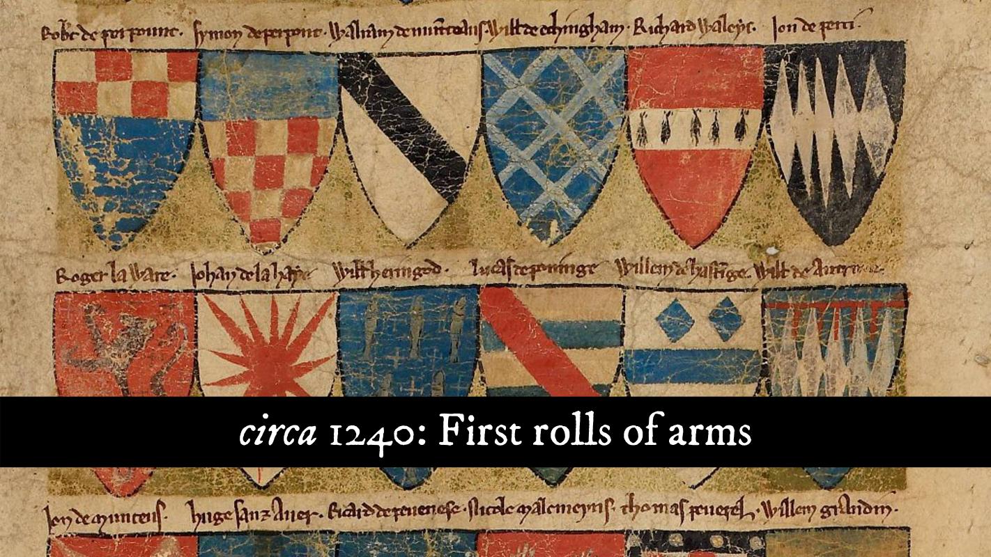
And that’s just what they did – we start seeing the first rolls of arms around 1240. This is the Dering Roll, one of the earliest rolls of arms, from around 1270 or 1280.
At this point, people could just start using any arms they want, which is only sustainable for so long. If we want to avoid impersonations and namespace collisions, we’re going to need some single source of truth to keep track.
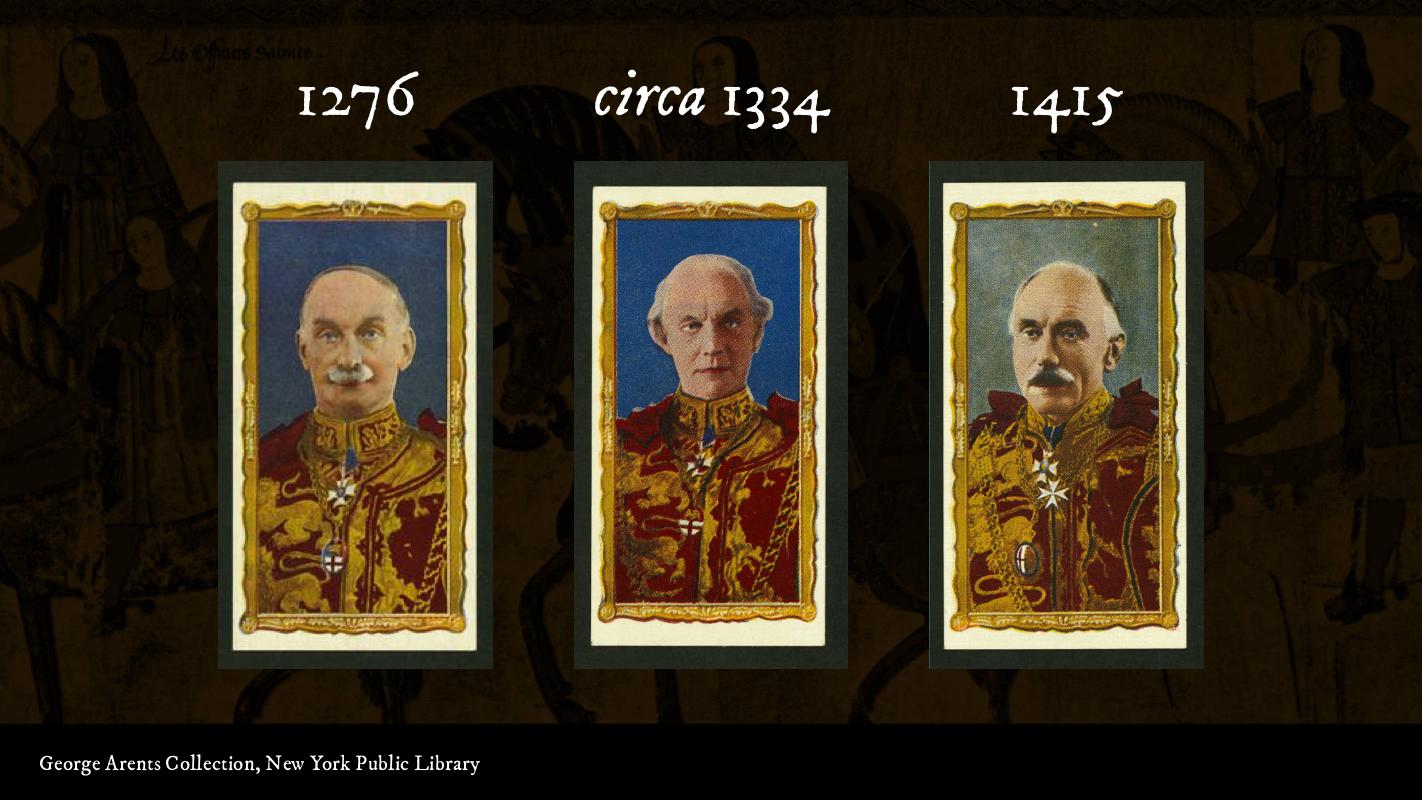
That’s what we see in 1276, when the office of Norroy King of Arms (Norroy and Ulster King of Arms since 1943), ‘the King of Heralds Beyond the Trent in the North’, was created. His first southern counterpart, Clarenceux King of Arms, was appointed around 1334; and the first Garter Principal King of Arms, the chief heraldic officer of the United Kingdom, was appointed in 1415.
These three offices still exist today, and they still collect a salary from the Crown. Unfortunately, the last time it was adjusted was in 1831, when they actually took a pay cut. For example, Garter King of Arms is paid the princely sum of £49.07 per year, while Clarenceux and Norroy and Ulster make £20.25. (Officers of Arms pay the bills through a combination of consulting work and a portion of the fees paid when someone applies for a grant of arms.)
Now that we have people in charge of keeping track of who bears what arms, we want to start making sure that the people using them have the right to use them. In 1417, during the Hundred Years’ War, King Henry V commanded the Sheriffs of Hampshire, Wiltshire, Sussex and Dorset to not allow any men to bear arms on the forthcoming expedition to France unless by ancestral right or by grant from a competent authority.
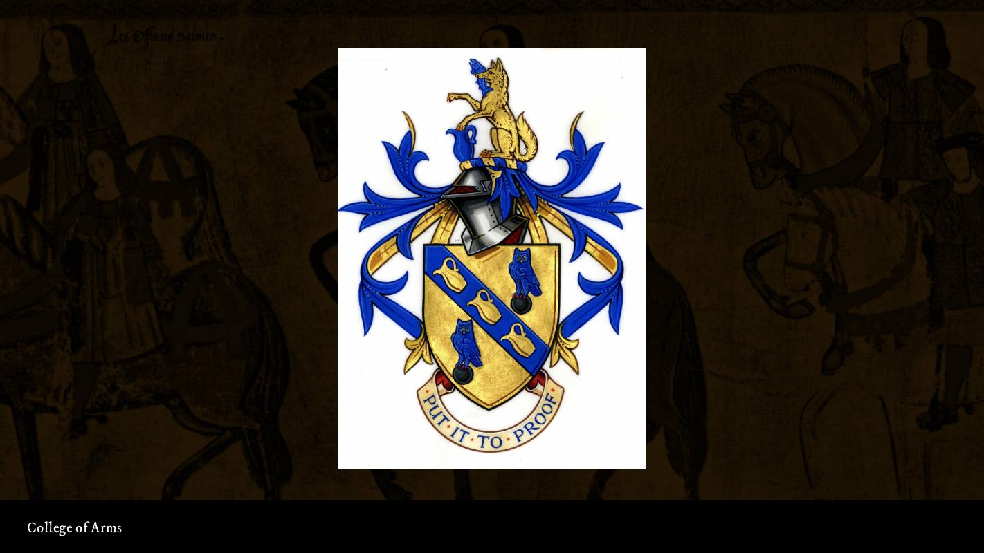
In 1484, King Richard III founded the College of Arms, the body that is responsible for administering all things heraldic – granting arms, keeping track of national symbols, and doing genealogy research – and the same body performs the same function today.
We have records and a body in charge of keeping those records, so now we need to make sure those records are clean. In 1531, King Henry VIII charged Clarenceux King of Arms to begin the Visitations – basically going around, knocking on doors, and asking people to prove they’re entitled to the arms they’re bearing – to ‘reform all false armory and arms granted without authority’. The Visitations lasted for about 150 years.
The College of Arms got a boss in 1673: the Earl Marshal, the highest non-royal hereditary office in the UK, who oversees the Court of Chivalry. No arms are granted without his approval.
Heraldry goes modern
Ovet the past 350 years or so, the symbolism and artwork in heraldry have evolved, but the rules have remained largely the same.
These arms look pretty traditional, but they were actually granted in 2017 to a gentleman named Robert Wayne Pitcher. Heralds are notorious punsters, so you see three pitchers on it. This continues the ancient tradition of ‘canting arms’ – some of the earliest arms are canting arms like this.
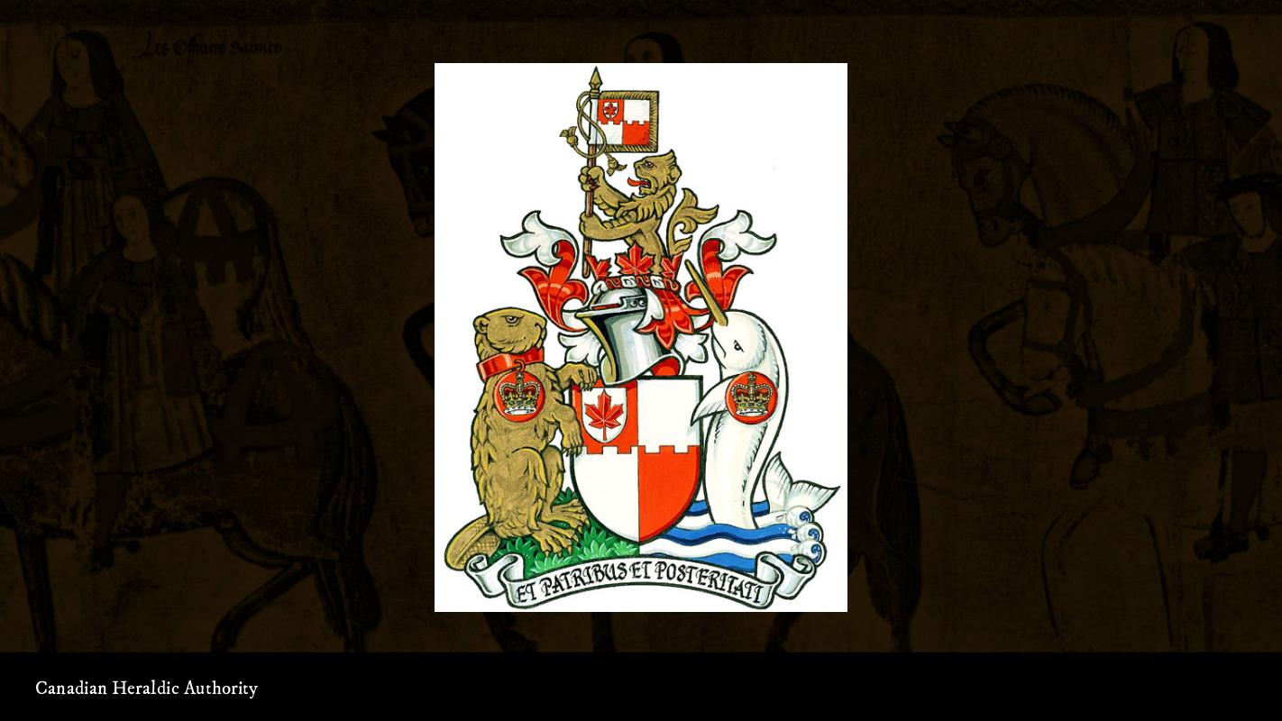
Canada has its own heraldic authority, and they’ve been known to push tradition a bit and use more native flora and fauna. Check it out – an angry beaver and a narwhal! How cool is that?

South Africa is doing really interesting things... it’s a former British colony, so it has that heritage; but part of the remit of the Bureau of Heraldry is to ‘Africanise’ heraldic symbolism there; so you see traditional-looking compositions, but with indigenous shield shapes, colours, and charges.
Speaking the same language
All of these arms, from the early ones I showed you on the Dering Roll from the 1200s to the latest cool stuff coming out of South Africa, is described by the same language. It’s called ‘blazon’: the specialised language used to describe the composition and arrangement of symbols on a heraldic device, like a shield, flag, or badge.
On the Web, we have our own specialised languages that describe the composition and arrangement of things – HTML and CSS. HTML describes the composition, and CSS describes the arrangement. (Okay, so this analogy doesn’t quite take into account the effect that markup has on the final product, but you get the idea.)
When you’re granted arms, you’re only granted the blazon – the technical description of your arms. Your letters patent, the actual thing you get, has a very nice illustration of your arms; but any illustration that accurately portrays the blazon is considered correct. You can think of this like browser rendering engines: there’s a spec they comply with – usually – but there are differences that aren’t necessarily wrong; they’re just different.
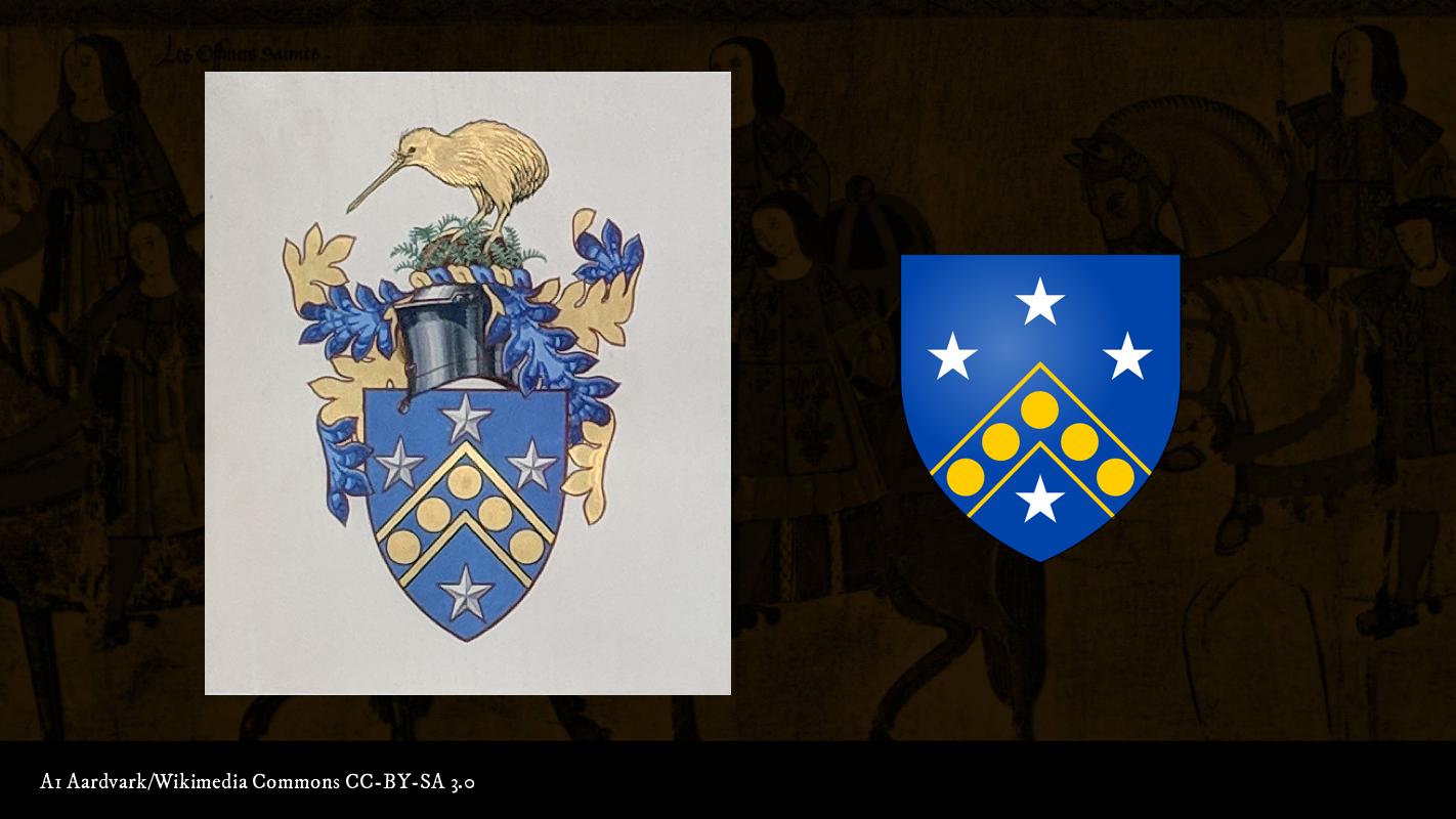
I’ll use the Bank of New Zealand as an example. On the left, you see the illustration by an artist at the College of Arms that appears on their letters patent. On the right is an illustration by a person called ‘A1 Aardvark’ on Wikimedia Commons. You see that even though they’re not identical, they’re still generally recognisable as the same arms. That’s because they’re both accurate depictions of the blazon.
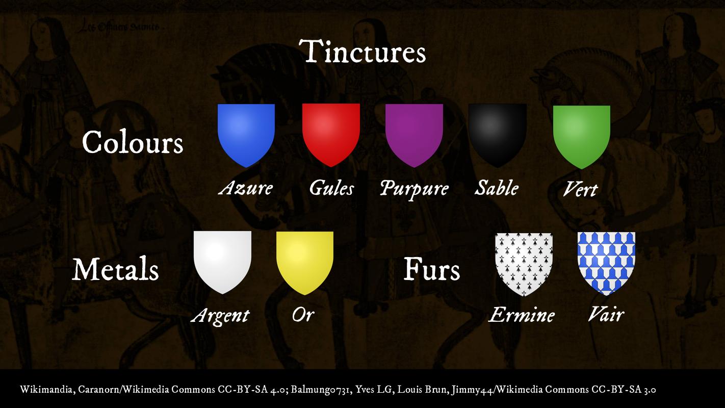
Blazon has its origins in the 13th century, so it sounds decidedly Middle English with a lot of French mixed in. Seven hundred years ago, we didn’t have access to all the cool pigments we have now, so we have a limited palette to work with. Colours in heraldry are called ‘tinctures’, and they’re broken up into three major groups: colours; metals, which were usually actually gold and silver leaf applied to the shield; and furs, which, yes, were actual furs.
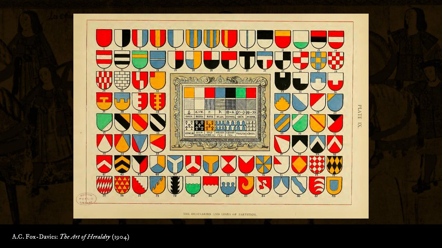
Now that you have tinctures, you have the lines of partition – words to describe how we’re arranging these tinctures on the main part of the shield. They go different directions, and the lines don’t even have to be straight, as you see on the bottom row.
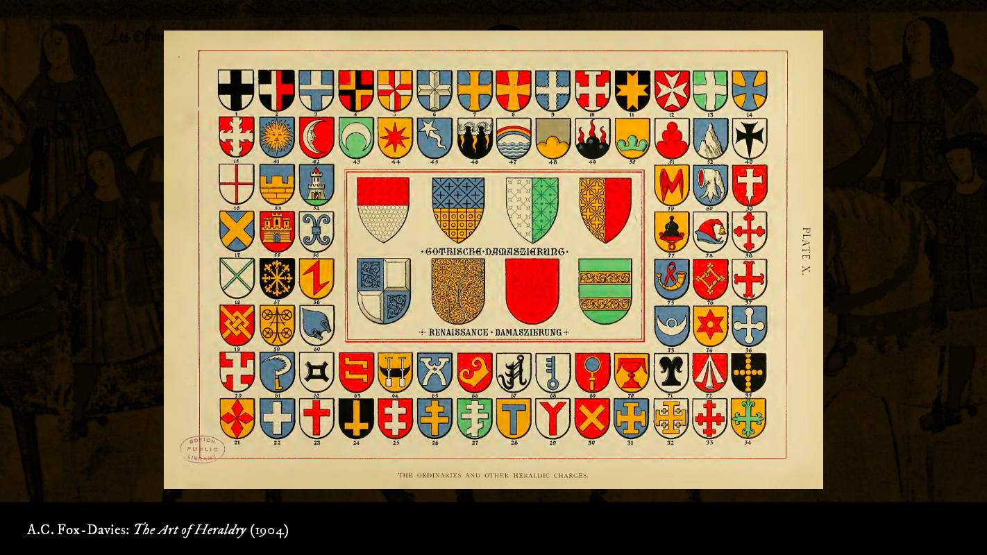
There are the ordinaries, which are your pales, fesses, saltires, and crosses, and then your more standard charges – suns, moons, stars, keys, pheons, maunches.... These all have names, and there’s a common language to describe all of them.
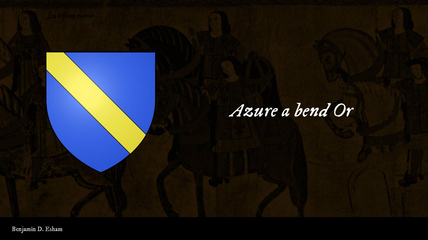
So you have some simple arms, like Grosvenor here – Azure a bend Or. Azure, blue, the background; a bend, which is a stripe running from top left to bottom right; Or, gold.
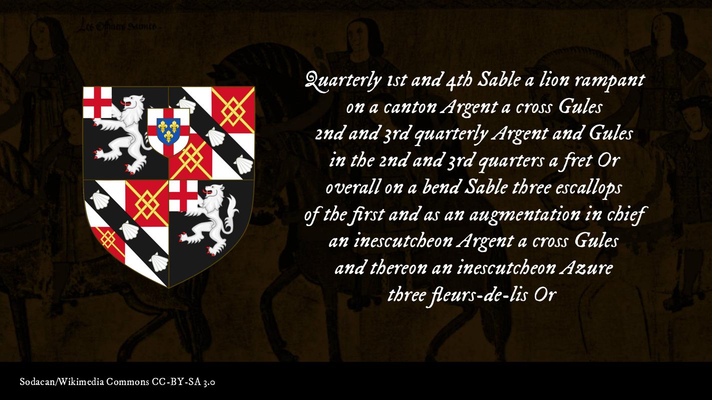
And this language scales. These are the arms of Winston Churchill. Even though Winston Churchill lived in the 19th and 20th centuries, if you gave this blazon to an artist from the 16th century, they’d come up with something that looked pretty much like this.
Arms today have the same qualities they’ve had for 800 years – they’re associated with a person, and they’re easy to identify at a distance. And we have our modern computery way of quantifying how easy it is to see something – evaluating the contrast ratio. The same thing developed in heraldry – one of the most important rules, if not the most important rule. The one simple 600-year-old trick that makes your website more accessible... the Rule of Tincture!
The Rule of Tincture
The Rule of Tincture first comes up between 1410 and 1450, depending on who you ask; but the best-known version comes from the Welsh scholar Humphrey Llwyd in 1568.
‘Metal should not be put on metal, nor colour on colour.’
What does that mean? Let’s look at our tinctures again.
Look at your metals, Argent and Or. Those are pretty light. Check out the colours – they tend to be pretty dark, right? What do we accomplish by not putting a metal on a metal or a colour on a colour?
Accessible colour contrast!
Let’s look at some examples:
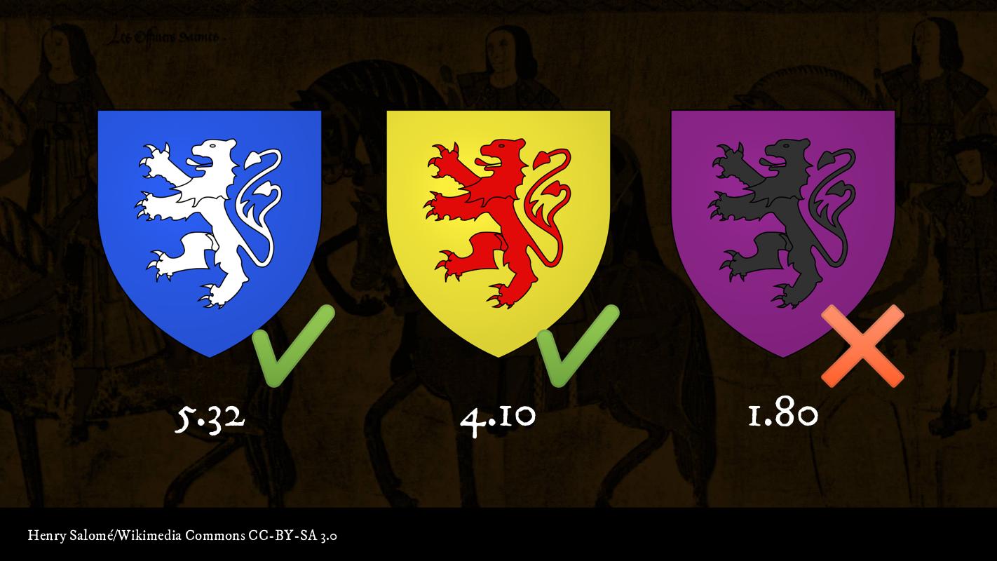
- Azure a lion double-queued rampant Argent – Metal on colour. This obeys the Rule of Tincture, and it passes the WCAG contrast checks.
- Or a lion double-queued rampant Gules Colour on metal. This also obeys the Rule of Tincture, and it passes AA for large text.
- Purpure a lion double-queued rampant Sable – Buzz! Colour on colour – this one fails the Rule of Tincture, and the colour contrast is not accessible according to the WCAG.
Let’s look at a little something more Webby. In this animation, the little counter moves along the gradient from a darker colour to a lighter colour. When the counter is on the darker side, the background is clearly like a heraldic colour, so the text is white so you can read it. On the right-hand side, the background is lighter – more metal-like – and so for the text to be legible, it has to be dark – a colour.
Breaking the rules
The Rule of Tincture is such an important rule that arms which violate this rule are calles ‘armes fausées’, or ‘false arms’. In France, they’re called ‘armes à enquerre’, because if you see them you’re supposed to be suspicious of their origin.
Like all rules, the Rule of Tincture is broken sometimes, but not very often, and more often on the continent of Europe than it is in England. Extensive studies of tens of thousands of arms from across Europe found that the rule is only violated less than two percent of the time – so for a field with origins as messy as heraldry, that’s about as hard and fast a rule as we can make.
But even if we break the rules sometimes, we can always get better. When it comes to accessibility, incremental improvements are still improvements. We need to set a high standard for ourselves, and keep working toward it so we can make the Web a better place for everybody.
Related Links
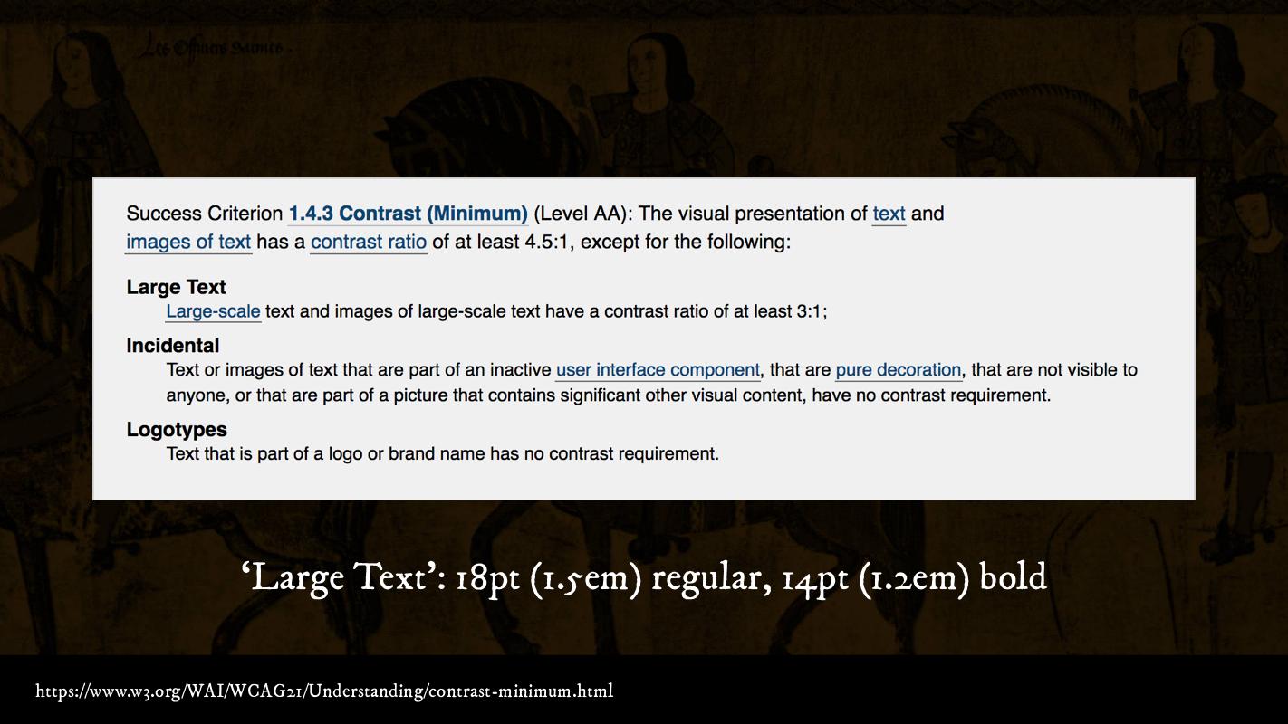
- WCAG 2.1: Understanding Success Criterion 1.4.3: Contrast (Minimum)
- Color Contrast and Why You Should Rethink It
- Colorable Text Demo
- Color: From Hex Codes to Eyeballs
- The College of Arms
- Canadian Heraldic Authority
- Bureau of Heraldry (South Africa)
- Simple Heraldry, Cheerfully Illustrated
- The Rule of Tinctures